We store cookies, you can get more info from our privacy policy.

Welcome to Nintendo World Report

by Steven Rodriguez - November 16, 2006, 3:21 pm EST
Total comments: 68

The videogame news site you know and love is ready for the new generation of Nintendo.

During the past five years, Planet GameCube grew into the largest independent Nintendo news and information website on the Internet. However, everyone knew that we couldn't be PGC forever. The Wii launch was the perfect opportunity for us to change our name to reflect Nintendo's new philosophy. It took months of tremendous effort for us to undergo this change. As the big day approached, we let the new name of the site slip to those that tuned in to Radio Free Nintendo eariler this week. However, the site's new look was still a secret to the public. Now is the time to lift the curtain on the biggest change in our site's seven-year history.

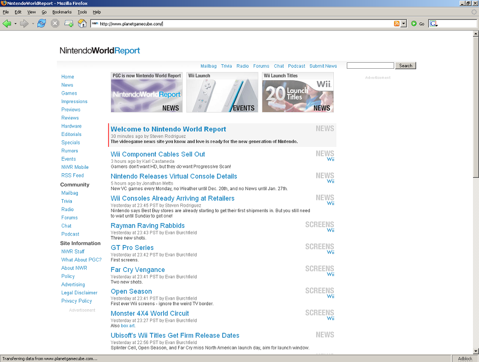
Ladies and gentlemen, I am pleased to present to you Nintendo World Report.

Our new name is a better reflection of who we are and what we do. We pride ourselves on reporting on Nintendo in a professional manner with a worldwide staff. The "World" moniker is a natural sucessor to the "Planet" flag we have flown since 1999, and not being tied down to a specific platform like we were with PGC means we don't need to worry about changing our name again for a very long time. A new name brings a new url - http://www.nintendoworldreport.com/ - so don't forget to update your bookmarks and tell all your mates about our new nameplate!

Likely, however, the new name wasn't the first thing that caught your eye. As you can clearly see, NWR brings with it a new super-clean Wii white look that is much easier on the eyes than our previous purple and black GameCube-inspired facade. It was a part of our overall effort to make site navigation easier for everyone (ourselves included). For example, the new front page design still has our traditional single-column headline display, but we've augmented it with a dual-column summary of older headlines below it. The idea of more content in less space also applies to our overhauled game profile and article pages, making it much, much easier to rapidly view screenshots and browse writeups pertaining to a particular game.

In addition to the name and design change, you may have also noticed a small shakeup on the staff roster. We announced it at the beginning of the month, but it deserves a repeating for those who haven't been to the site for a while. Jonathan Metts, site Director during the Planet GameCube era, has relinquished that title and taken on the less intensive role (or so he thinks) of Reviews Editor. It required two people to fill the shoes that he stepped out of: Evan Burchfield is our new PR Coordinator, and I, Steven Rodriguez, have been appointed the new Director of Nintendo World Report. More staff changes will be coming in the months ahead.

Another important change to Nintendo World Report is actually an addition, and a long-overdue one; our editorial policy is now available for the public to view. We do things a little differently here at NWR, and now that everyone can see why it is we do things in the way that we do, we know people will better appreciate our philosophy. Please take the time to read it!

Of course, a redesign of this magnitude can't be completed without thanking the people who brought it all together. First up, thanks to Ryan Jones for designing the new site. We all were giddy when we first saw the new look, and what you see before you today isn't that much different than the initial mockups. (We're glad he nailed it the first time!) Second, props go out to Brendan Gallagher, who did some CSS coding gruntwork during the building of the site and, earlier this year, recoded most of Planet GameCube's CSS to make the site load faster and to make it easier for us to work on the new design. Last, but definitely not least, Michael Cole gets the biggest thanks of them all for spearheading the redesign project, which was months in the making. If not for his efforts, you wouldn't be seeing the new site at all! So again, thanks to them, and everyone else who helped pull this thing together.

Finally, we want to thank you, our readers. It goes without saying that we wouldn't be able to do this without all of your support. The changes to the site were all done with you guys in mind, so we hope they are to your liking. We have ideas kicking around behind the scenes that may eventually become new site features of Nintendo World Report, but those are going to have to wait until after the Wii's first months are behind us. We're going to be too busy writing about all the new Wii (and DS) games that are coming out!

On behalf of the entire Nintendo World Report staff, I hope that you enjoy the new site and check back to it often for the best Nintendo coverage on the Internet.

Talkback

archioverloadNovember 16, 2006

First!

And, holy crap, nice redesign!!!

vuduNovember 16, 2006

No you're not. I beat you over here.

Plus at least I had something useful to contribute. face-icon-small-tongue.gif

Guitar SmasherNovember 16, 2006

I like the name very much. However, I think the Ads are a little too dominating with the new design. The design itself is OK, but a little bare.

Nick DiMolaNick DiMola, Staff AlumnusNovember 16, 2006

Too Much Text... You guys need some way to break up the middle text a bit. It feels really cluttered but I'm no expert.

That's probably the spacing between each line vs the spacing between paragraphs. It isn't all that much of a difference. I fall back on Ryan being the UI designer. I didn't notice it as being a problem myself, but I can understand your comment.

BigJimNovember 16, 2006

Looks like a Wordpress blog. Definitely going to take some getting used too.

The Flash over the images at the top is cool. face-icon-small-smile.gif

Can you give the left side navigation a differentiating shade of silver or something? I have ads blocked in Firefox, so maybe it just looks especially bare and white to me... Maybe ease up on the wordiness too?

Shift KeyNovember 16, 2006

Just a headsup - the links in the newspost article are not correct. As you can click them on the main page and on the forums you'll end up at two different locations. My HTML is really rusty but it would be something to do with relative or absolute links.

The forum links will not work in their current form. The main page links work fine. I guess this was working fine on the old PGC website and just needs a couple of lines of code added when articles are ported across to Talkback threads.

WindyManSteven Rodriguez, Staff AlumnusNovember 16, 2006

We've actually known about the links problem in the forum for a while now. It's on our to-do list.

Everything is fine on the main site, which is the most important.

...why do I... hate the redesign so?


The idea of white is supposed to make things look clean and contemporary, but instead you guys clutter everything up excessively with text and ads, killing the effect and turning a post-modern sensibility into a lazy-esque white background for big groups of text?

Now it...just looks like a cheap blog?


/cries

I feel so weird and disappointed and confused!

~Carmine M. Red
Kairon@aol.com

PaleMike Gamin, Contributing EditorNovember 16, 2006

Oh wow. I didn't notice the cool new screen shot and art pop up before. That's awesome. Everyone go check it out!

BigJimNovember 16, 2006

Agreed on the wordiness and whiteness, Kairon

Ian SaneNovember 16, 2006

I can honestly say I never would have guessed this name in a million years. The name makes sense though. I'll probably end up saying "PGC" for a while though. PGC always had the benefit of having three "EE" sounds in a row. NWR doesn't roll off the tongue as well. Plus W is the worst letter for abbreviations since it has several syllables. But it's a decent name still and it won't need changing unless Nintendo themselves changes their name.

The site design however looks like a squater site. You know like if you accidentally type "com" instead of "net" into an address and some ad site is there instead. I initially thought that maybe I had mistyped the URL.

RhoqNovember 16, 2006

Quote

Originally posted by: Ian Sane
The site design however looks like a squater site. You know like if you accidentally type "com" instead of "net" into an address and some ad site is there instead. I initially thought that maybe I had mistyped the URL.


NWR's color scheme is very "clean" looking and matches the Wii perfectly. However, I do have to agree with Ian. Had I not heard the new name yesterday, I would have assumed that I hit a bogus url just because of the way the new front page is designed.

BigJimNovember 16, 2006

Should we make the "t" in "report" silent just for fun? face-icon-small-wink.gif

AnyoneEBNovember 16, 2006

I agree, it could use a bit more color.

Why are the three key news items images at the top now flash? I admit that I usually just use the main news listing anyway, but it's still annoying that those are not links.

Shift KeyNovember 16, 2006

Quote

Originally posted by: BigJim
Should we make the "t" in "report" silent just for fun? face-icon-small-wink.gif


Crazy Canadians

EntroperNovember 16, 2006

IMO, the overall design is great. It's sleek, it's clean, and it's very Wii. More info is visible at a glance, so woot to that.

I think a TREMENDOUS improvement would be the addition of some faint borders to separate sections of the page. Right now it's just some white-background stuff floating in a sea of white, and some lines would really help direct the readers' eyes.

Nick DiMolaNick DiMola, Staff AlumnusNovember 16, 2006

Another suggestion not to be a jerk, but it would seem to make sense in the additional content area to only list the date once and group everything underneath that. The constant date listing looks redundant, it'll probably reduce the clutter as well. I do like the color scheme and stuff, I just think some touch ups need to be made before you settle on the design as final (IMO).

Sir_StabbalotNovember 16, 2006

Yeah, it looks a little too plain now. Name's nice, though.

JonLeungNovember 16, 2006

Quote

Originally posted by: vudu
No you're not. I beat you over here.
Plus at least I had something useful to contribute. face-icon-small-tongue.gif
No, YOU'RE NOT. I beat you over here. There wasn't even a topic of this change at the time yet...

EDIT: Edited for spelling because I'm not an illiterate 3-year-old.

SvevanEvan Burchfield, Staff AlumnusNovember 16, 2006

On behalf of TYP who has worked hella hard on the redesign I want to tell you that although we value your opinion and want to hear if you like it or don't, we really do not have time for suggestions and will be honoring absolutely none of them. TYP has enough to do and there are plenty of features on the staff side of the site that TYP has deemed more important than color change and simple formatting. Plus, these things are not as easy to change as you think (I learned this from experience). So again, we value your opinion, but don't expect us to change anything for now.

Also, please be considerate of the massive amount of work our unpaid designers and tech guys have done.

AgesNovember 16, 2006

I'm diggin the new name, but the page is lacking in personality. Oh well, I come here for the news anyway, so I guess that's all that matters. Oh and for the people complaining about the ads, you should see it ad free...very...uh white

UltimatePartyBearNovember 16, 2006

I turned off adblock and flashblock and reloaded the site, and only saw two ads. It barely impacted the look of the site. I'm sure there will be more after things settle down, but I don't get how the ads make things look cluttered.

RizeDavid Trammell, Staff AlumnusNovember 16, 2006

While Svevan makes good points, know that some on the staff agree with the general sentiments expressed by readers in this thread and will bug the appropriate people on your behalf when appropriate.

And Svevan, don't underestimate the importance of look and feel. That could easily make the difference between a person bookmarking the site or forgetting about it.

Blue PlantNovember 16, 2006

Quote

Originally posted by: Entroper
I think a TREMENDOUS improvement would be the addition of some faint borders to separate sections of the page. Right now it's just some white-background stuff floating in a sea of white, and some lines would really help direct the readers' eyes.


Seconded. The articles really do need some kind of separation away from the sidebars.

Great work though, guys. Looks very clean.

Athrun ZalaNovember 16, 2006

OMFG

I was reading Kohler's blog, clicked on the RFN link and thought I got into some random blog, so clicked on my PGC bookmark and was shocked..... I had completely forgot about the redesign! oO

so, ahem, agree with most, too much white, and a little separation between sections would be greatly appreciated ^^
no hurries though face-icon-small-happy.gif

in any case, I'm pretty surprised that Pro was SO CLOSE on guessing the name (he did guess the Nintendo World part face-icon-small-tongue.gif )

t slogNovember 16, 2006

the new site is worth of an award. here's a *.

MorningStarNovember 16, 2006

Quote

Originally posted by: Ian Sane
The site design however looks like a squater site. You know like if you accidentally type "com" instead of "net" into an address and some ad site is there instead. I initially thought that maybe I had mistyped the URL.


It's funny that you mention that. I thought the same exact thing when I went to my bookmarks and clicked on PGC; I thought my browser had screwed up and sent me to a bogus site.

LouieturkeyNovember 16, 2006

Heh, I clicked my bookmark, then opened a second tab and opened something else. I came back here and forgot which site I was going to. When NWR came up, I thought my bookmark got corrupted or the site I went to had let their domain name expire only to have it grabbed by a squatter. After finally figuring out what it was, I was impressed. It'll take some getting used to though.

MorningStarNovember 16, 2006

I love how at the very top of the site it says "Nintendo World Report" followed by one of those "True" ads with some skanky chick modeling. Pretty funny.

Nick DiMolaNick DiMola, Staff AlumnusNovember 16, 2006

Svevan, I hope I didn't upset you with any of my comments. I can tell how much work was put into the formatting and I respect all the effort you guys went through. I think all of us just want the site to be perfect because we love it so much and have an attachment to it. I would love to see you guys pick up an even larger following, and like Rize said, the smallest amount of formatting can make the difference between someone bookmarking and someone not.

As I said, great work guys, I like the color scheme and the flash and the stylized look. A few small formatting things and this site will look perfect.

CalibanNovember 16, 2006

I don't see why all these design complaints are showing up, it looks perfectly fine to me, then again I read blogs more than news sites so go figure. After browsing a little more, the new layout, I like it alot.

BigJimNovember 16, 2006

Nobody's calling for an overhaul or anything. The site is 85% there. It just needs some tweaks.

SmadteNovember 16, 2006

"Does Brittany belong with K-Fed?"

That's the first thing I saw when I visited this site, and I thought I had gone to the wrong place ... the whole page, for a couple of seconds, looked like an advertisement place-holder for a website that doesn't exist. I would make the name of the site larger and put it near the middle so the advertisement doesn't dominate. Those advertisements are an eyesore, I tell you.

steveyNovember 16, 2006

Sorry but I hate the new look, it's way too dull. Can you add more color and border lines to separate the different parts and get rid of the posted XXX ago time, or atlease have a link on the main page to view the site in the old PGC layout?

SvevanEvan Burchfield, Staff AlumnusNovember 16, 2006

No and no. We've covered this. I don't mean to be firm, but none of the options above are worth our time right now (and they would take a lot of time).

DjunknownNovember 16, 2006

This is my 3rd post since I since I opened up my browser and was given a pleasant surprise. No real complaints here, since I know this is just the beginning. And with the Wii dropping in less than 72 hours, I can safely assume what the NWR staff will be doing. Not only that, they'll have to tear away long enough to write reviews/impressions/previews to the poor souls who either don't have one, or don't have whatever title they're reviewing. You have my respect.

Keep bangin' NWR. I sense the best has yet to come...

vuduNovember 16, 2006

Quote

Originally posted by: Svevan
No and no. We've covered this. I don't mean to be firm, but none of the options above are worth our time right now (and they would take a lot of time).
My favorite part is (AFAIK) Evan doesn't do any of this stuff. face-icon-small-smile.gif

ArtimusNovember 16, 2006

Quote

Originally posted by: Svevan
No and no. We've covered this. I don't mean to be firm, but none of the options above are worth our time right now (and they would take a lot of time).


That's nice to know, but if you think this design will win you new visitors over the next few weeks you're dead wrong. A large portion of visitors will go back to google when they stumble upon NWR. That's a major problem.

Who care what your content is if no one reads it?

And btw, what the readers say is perhaps the most important part of your site. Be careful how quickly you blatantly dismiss their input. Tact is a useful thing.

RizeDavid Trammell, Staff AlumnusNovember 16, 2006

Evan is just trying to say that we can't make any quick changes any time real soon. The guy who would have to do such things needs to focus on other stuff for the moment and has already put in an enormous amount of time. For better or worse, NWR is going to be as is for at least the rest of the year apparently. Hopefully any previous reader that is somewhat put-off can bear with us for now.

ArtimusNovember 16, 2006

Quote

Originally posted by: Rize
Evan is just trying to say that we can't make any quick changes any time real soon. The guy who would have to do such things needs to focus on other stuff for the moment and has already put in an enormous amount of time. For better or worse, NWR is going to be as is for at least the rest of the year apparently. Hopefully any previous reader that is somewhat put-off can bear with us for now.


Oh I'm sure no one would stop coming! It's not unreadable. It's just new visitors I'd be worried about...

RizeDavid Trammell, Staff AlumnusNovember 16, 2006

Hey, if you want to see something awesome go click on a screenshot face-icon-small-wink.gif

Shin GallonNovember 16, 2006

Awesome, I like the new look, reminds me of the Wii packaging itself. Very sleek and easy on the eyes.

SheckyNovember 16, 2006

Quote

Originally posted by: Pale
Oh wow. I didn't notice the cool new screen shot and art pop up before. That's awesome. Everyone go check it out!


Quite impressive indeed. I keep finding reasons to love the new site.

18 DaysNovember 16, 2006

Looks EXCELLENT.

Smoke39November 16, 2006

I miss having a "next" button in the screenshot galleries.

TrueNerdNovember 16, 2006

I think the redesign is pretty slick. Way neater then PlanetLAMECube's layout. Although, I do wish the ads were a little more subtle and not so prominent, but that would be my only complaint.

Kudos!

wanderingNovember 16, 2006

AAAAAAHHHHH my eyes!

*puts on sunglasses*

Much better.

Lot's of impressive stuff going on. I like the use of the Wii colors - the hint of red is an especially nice touch. I like the little graphics on the right hand side ("NEWS - Wii", etc.) And yes, what happens when you click on a picture is very nice (though I'd appreciate 'previous' and 'next' buttons.) I like the logo. The use of flash is good. I know you guys put alot of work into the design, and the results are impressive.

But, I have to agree with others' complaints about it being too white. Now - we could all just be in shock. Maybe, objectively, there's nothing wrong with the design. I remember there was something of an uproar when one site I frequent went from looking like this to this. But I got used to, and came to like, the new design there, and maybe I will here.

...But, perhaps we aren't in shock, and perhaps there is room for improvement... in which case, I'd like to offer one suggestion. (Though I hate to give specific suggestions for things like this. Partly because I don't know if they'll be appreciated, but mainly because, one time, someone showed me a short story of his and I gave him a long list of suggestions. He followed them, and the end result was like a toothpick sculpture that had been touched up with a chainsaw. Anyway.) My immediate thought was that the site might look better if some of the white-on-blue was replaced with blue-on-white. If you, for example, flipped the colors in the navigation links on the left-hand side, so that they would always look how they look when you hover your mouse over them...like this (thrown together in paint.)

Oh, one other suggestion, if I may. I think the light grey you're using is too light. Maybe it's just my monitor, but I can barely see it. I think the site would look cleaner if you darkened the light grey areas, or removed them entirely.

I guess the idea behind these suggestions is the site needs more contrast. Contrast is something even Nintendo understands the importance of....look at the press photo of the Wii on the front page, and note how it isn't pure white. See how dark the shadows are.

Just my two cents.

mantidorNovember 16, 2006

the design is ok, but to be honest, I never go out from the forums, and since the news get their own automatic thread I've never seen a need to do it. I thought the forums were going to get a redesign as well, but if its not the case, then I'll barely notice the change.

Shift KeyNovember 16, 2006

Quote

Originally posted by: TrueNerd
Although, I do wish the ads were a little more subtle and not so prominent, but that would be my only complaint.

Kudos!


Firefox + AdBlock = BAM!
nwr_firefox.png

WindyManSteven Rodriguez, Staff AlumnusNovember 16, 2006

Quote

Originally posted by: mantidor
the design is ok, but to be honest, I never go out from the forums, and since the news get their own automatic thread I've never seen a need to do it. I thought the forums were going to get a redesign as well, but if its not the case, then I'll barely notice the change.


We're going to eventually tweak the color scheme of the boards a bit, but they should remain largely unchanged besides that.

PlugabugzNovember 16, 2006

It looks really good! Tiny suggestion, add a breaker line between the new content and the old.

The flow of text is a bit force fed down your throat.

GalfordNovember 17, 2006

Wow, I really don't know what to say about the new design.
I guess I'll have to give it a while.

No more PlanetGamecube? Well I guess it's the end of an era.
I remember the night PlanetN2000 changed to PlanetGamecube,
now I see it again.

The new name should prevent this site from
having to change it's name again.

Dozy BoyNovember 17, 2006

I'd like to second the "next screenshot" issue. It may be convenient to have the picture load up without actually navigating to a new page, but if I want to look at all the screens in sequence (and I almost always do) then I actually need MORE mouse clicks and location-keeping-track-of than before. I would love to see the exact same format as it is currently but with next and previous links implemented. That would be perfect.


Please?

Ian SaneNovember 17, 2006

"On behalf of TYP who has worked hella hard on the redesign I want to tell you that although we value your opinion and want to hear if you like it or don't, we really do not have time for suggestions and will be honoring absolutely none of them."

Sounds like something Nintendo themselves would have said. HA! face-icon-small-wink.gif

SvevanEvan Burchfield, Staff AlumnusNovember 17, 2006

I try.

MikintoshNovember 17, 2006

The new site doesn't really have any character to it, sorry.

couchmonkeyNovember 17, 2006

I know this stuff's definitely not easy to change, and I'm not expecting any miracles or anything, just giving my feedback for future reference. I totally appreciate how many other important things must be going on since I code, write and design my own site. I've been working on an overhaul like this and I've spent two years to get worse results than NWR has managed in just half a year.

Two more things I noticed:
- I like the colour coding on the system names in the news (eg. orange for Game Boy Advance)...I missed that before (maybe because there are so many Wii articles)
- In Firefox 1.0.7 (yeah it's old) the menu bar sometimes appears above the rest fo the content instead of beside. Most noticeable on the splash page.

Dozy BoyNovember 17, 2006

Whoops. Sorry for the suggestion. Seriously, I didn't even read Sveven's original post. My bad. That'll learn me to just hop on and reply.

RobageejamminNovember 17, 2006

I really think you have a great design on your hands that only needs a little tweaking. There are so many great things working on NWR its unbelievable. The displayed time since the article was made, the new image viewer, the categorizing of everything, and not to mention the amazing improvement on the reviews pages. I have to applaud everyone who worked on this for putting so much time and passion into something purely voluntary. I think that all of these features will bring in a much wider range of people to the site but at the same time, I can see some of the aesthetic qualities throwing people off.

Like I said, I really do think you have a great design. It just looks a bit unfinished. The most noticeable part of this is how little separation there is between different sections of the page. The gradient on the top is a great start, but I think more of that could be implemented to further this. The 3 flash boxes are also a great addition but seem a little lonely compared to the rest of the non flash site. Again, just more of this would be great. The last thing I'll say is that the brand new name of the site, Nintendo World Report, should take up much more room on the page. I think its such a great, strong name that needs to be a much more powerful part of the site.

I made an example of some of the things I talked about, along with some of the suggestions we've all talked about recently which you can find here...

http://img.villagephotos.com/p/2005-2/947569/nwrsample2.jpg

I would love to know what everyone thinks, what you think works, doesnt work, and maybe we can solidify some of our concerns for the best Nintendo site on the planet.

Also, I just want to make it clear that I am in no way trying to push anything on the staff or telling anyone what to do. These are purely just ideas I'd like to share with everyone. After all, it is a forum.

BigJimNovember 17, 2006

Quote

http://img.villagephotos.com/p/2005-2/947569/nwrsample2.jpg


I'd hit that. Did you try silver stripes along the top before choosing the blue? Might be a tiny bit too much blue on the page, but I'm not sure if silver on the top would be any better. Overall awesome.

KirbySStarNovember 17, 2006

Robageejammin, that can't be too hard to pull off. It's a very simple suggestion and the contrast does wonders. It looks much like the forums do right now which are more pleasing to the eye right now than the main site. Too much white is a terrible thing but just the right amount of contrast will let you escape from flashbanging yourself whenever you load the site in a dark room.

I know that there are still bugs and things being worked out and perhaps small additions in usablity to the site but once that is done I highly recommend you use Robageejammin's example as a template for the site. It will do you a world of good. It can't be that hard to implement. At least do it to the center. That's where it needs the contrast the most.

KirbySStarNovember 17, 2006

Also, you guys need to change your google ad coloring to match the new site. Seriously, the purple google ads really clash with it.

Oh, and the forum colors are perfect. Perhaps the only thing you'd need to change is maybe the dark purple to perhaps dark grey or blue. Keep the the rest of the colors though.

RobageejamminNovember 17, 2006

Yea, I was messing around with different gradients so much that I lost focus. When its desaturated it a bit it looks much better.

Smash_BrotherNovember 17, 2006

Cheers, guys.

To many more successful years!

Tuxedo.BondNovember 20, 2006

First thing that hit my mind was if I had hit a bogus page, then a split second after I figured it was the new site. However I am definitely not a fan of pure white web pages, as they are much harder on the eyes (to me at least...).

A few suggestions:

Add some borders and/or color to the site and it's side bars and stuff.

Increase the font size a little bit. Although I can do that with my Opera browser, it would still make it nicer. Possibly think about changing the font type.

And did I mention that you are paying for my glasses after I go blind from the brightness of the white? The bill is in the mail. Thanks. face-icon-small-smile.gif

Now for the things I do like:

I like how easy it is to see the past weeks news on the bottom, as I sometimes don't check back for a while and i don't like strolling through the news pages for stuff I missed.

The way the pictures are now displayed is very nice. I can view them and navigate the photos easier and faster.

The information displayed for a company profile is nice and easy to see all on one page. Although I must be blind (possibly from the *Wii White* scheme) or something, because I don't see a link to the company profiles on the front page...

And I think the images that tell you what the posting is for (news, screenshots, etc) and for what system (DS, GBA, Wii, etc) is really nifty and easy for me to find what I want really quickly.

IceColdNovember 21, 2006

Welcome to Planet Meteos..

decoymanNovember 22, 2006

Robageejammin, it's great that you worked something up, but I don't think the site needs that much change... there's a subtle balance between minimalism and being busy in this case. There are too many gradients, and (believe it or not) too much color. A couple well-placed gradients are more than enough, and minimizing the colors is the idea here. I honestly think this design is really really close to being great...

This sort of style calls for a light hand, a delicate mark. I think, as I mentioned before, that some masterfully-placed light grey rules would help immensely, along with doing a breaker between the days in the news items. Again, it's the textual hierarchy that needs a little TLC, and this may be accomplished with just these minor suggestions.

EDIT: Forgot to list what you nailed, Rob- The size of the site name is spot on – That's exactly where it should be. Also, I think the light grey bars separating news items is a decent idea as well, but the same might be accomplished with rules instead of shades of grey, which migh be a better option. The grey bars could be used to separate the days, perhaps... again, we basically have to see it before we can know if it works.

EDIT2: OR, (I don't know if this is feasible from a technical standpoint) maybe the headlines from the current day are blue, and the headlines from past days are grey... that would be another way to differentiate the days anyways. When I visit the site, I'm most interested in what's new anyways.

Got a news tip? Send it in!
Advertisement
Advertisement