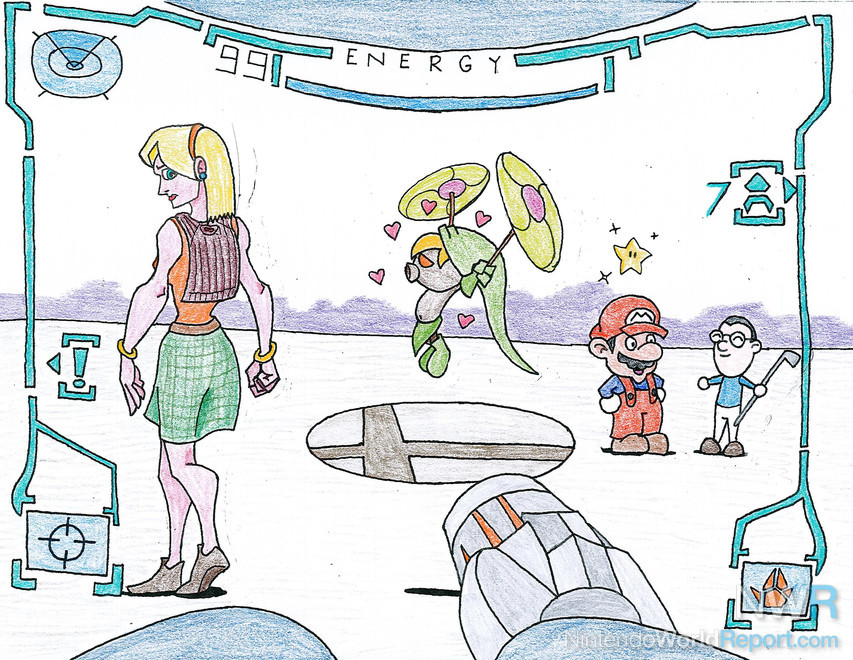
I knew from the get-go that trying to wedge six different characters onto a single page (and keep the image interesting) would be daunting, so I came up with an interesting solution: invoke Metroid Prime by duplicating its viewpoint—perhaps that game’s essential innovation. I knew that Deku Link would be involved to stand in for Majora’s Mask, as he is probably the most iconic aspect of that game. I wanted Deku Link to be interacting with a Resident Evil 4 character: the dichotomy between small and large if often effective and funny. But what would they be doing?
Early drafts of the picture have Deku Link scrambling to get away from an RE4 monster. At one point it was U-3, a boss from the caverns. However, U-3 is so large and complex that every other character would be glossed over! So I began simplifying, first to the Alien-creature from the sewers, then to a general Ganado with a “centipede” Plaga for a head. But it just felt like too much, and getting the detail right on the Plaga was killing me, so I took that aspect of the picture in a totally different direction: Ashley Graham being followed by a love-struck Deku Link. He looked too short on the ground, so I popped him into the air using his pinwheels. I like the look on Ashley’s face—she’s more annoyed than anything else.
Mario and the Mii were the easiest part of the whole picture. I wanted them to be chatting away, as they are (currently) the most iconic Nintendo characters. Earlier drafts did not include Mario’s little star buddy, but I needed something to invoke Super Mario Galaxy over any other Mario game, so I tossed him in at the last minute. You might recognize the Mii—it’s me, after all.
Finally, Super Smash Bros. Melee. I couldn’t come up with anything that was distinctly a part of that game. I tried lots of things: Mario holding a Beam Sword (it didn’t read well), everyone standing on one of the Melee stages (made the viewpoint wrong), and even the brief inclusion of Mr. Game & Watch. However, all of these things could also mean Super Smash Bros. Brawl, which also came out in the last decade, and which is basically Melee but better. When you think about it, there isn’t much that’s really distinct about Melee that you could insert into a stylized image that would disassociate it from the original N64 game or Brawl. I eventually just accepted that fact and tossed the Smash Bros. trophy base in the center of the ground. I’m not super-happy about it, but I couldn’t think of anything else.
Now that I had the concept and sketches done, the real work began. As my colleagues know, I am technologically inept. While I have a basic knowledge of Photoshop Elements 8.0 (and a bitchin’ Wacom tablet), it takes me twice as long to do anything with it because I wade through menus and don’t use hotkeys. I’m also still adjusting to the concept of layers. So I did this drawing with traditional media. First, I sketched every character separately on a single piece of paper without any thought to how they would eventually be arranged. When I was satisfied with their poses, I inked them with Micron Pigma (Dengar) pens. On a separate piece of paper, I sketched and inked Samus’ visor and arm cannon. Once I was happy with it (I used a screenshot as a guide), I cut out my inked characters and arranged them on the Samus piece, then taped them down.
Unfortunately, I noticed that I had originally drawn (and inked) Ashley with a ponytail. I had to actually cut off the back of her head, redraw a new hairstyle, and paste it onto the Samus + Ashley cutout. Boy, I’m better with layers than I thought! That was a painful process, because I’m always worried that the scissors will gouge too far into the page and leave a dent, which then shows up as a shadow on my scanner. Luckily, that didn’t happen.
So next, I took this B&W paper-doll piece to my copier/scanner and copied it. It came out nice enough, but there were some very noticeable shadows along the edges of the cutouts. So I took some whiteout to the shadows and tried to hide them. I let the whiteout dry and tried copying the copy, and it came out much better. There’s still a bit of a streak behind Ashley though, but…eh. At that point, I didn’t care anymore. Now that I had a working B&W base, it’s time to add color!
Now, if I had the time, I could have easily edited and colored this with my Wacom, but my schedule has been horrible lately, and my bedtime was coming up. I whipped out my trusty colored pencils and, during an episode of Next Generation (the one where we discover that warp drive damages the fabric of space-time or whatever), colored the whole thing. The purple glow in the background exists solely to put contrast between the white background and the character outlines. I think it works well.
I wish I'd spent more time on Samus' arm cannon, but hey, maybe next time, right? Hope you folks like it.