A little customization could go a long way.
http://www.nintendoworldreport.com/feature/35329
Welcome to our new feature, Paving the Way We Play, in which I invite our staff to discuss small changes we would like to see Nintendo implement in their products. If there's a niggling little issue that rubs us the wrong way about a series or system, or anything Nintendo in general, we're here to rant talk about it, within fair reason of course.
Anyone who had a 3DS at launch knew the turmoil involved with the initial System Menu build. With the eShop flooding with new Virtual Console and digital games to choose from, gamers were quickly running out of menu real estate to organize their rapidly accumulating collection of applications. Even with an ample SD card plugged into the device, the limited number of slots available on the menu simply meant you could not have access to all your downloaded software at once.

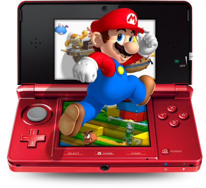
See? Mario can't even fit in the 3DS anymore!
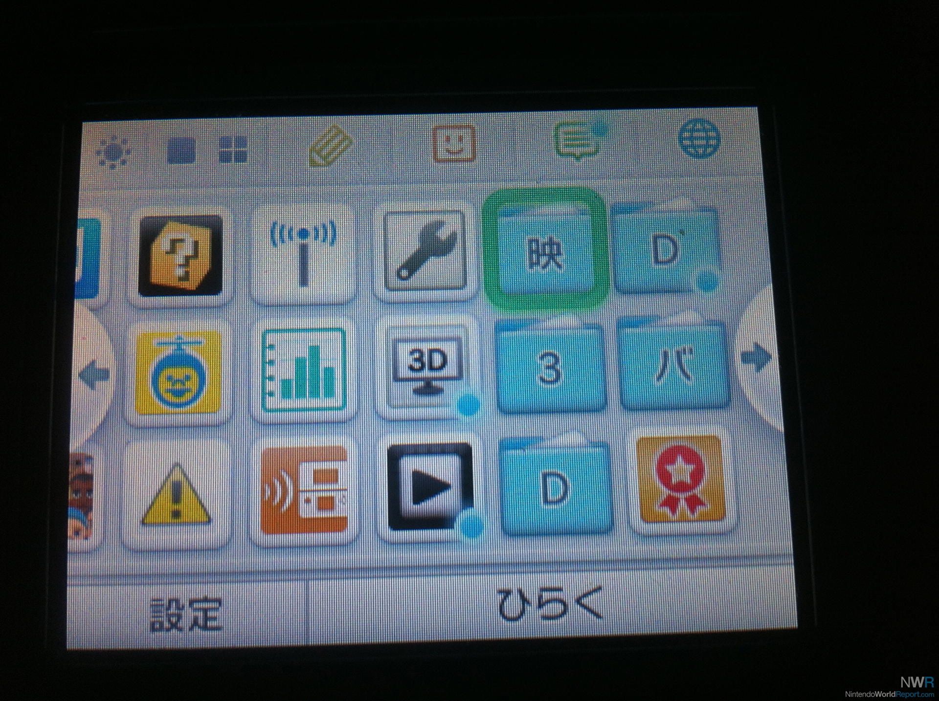
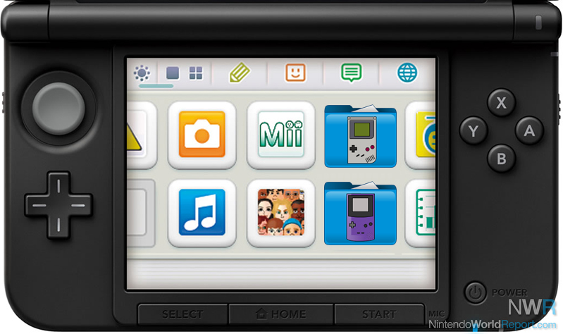
Then came the firmware update we needed; folders were added to the menu allowing us to tuck our games away into manageable little groups that could be moved around. The issue was solved! Still, the aesthetic aspect to the update left something to be desired. Every single folder you create is the exact same blue color, and while you can give your folder a name that appears on the top screen when selected, only the first letter is displayed on the folder icon.
For some people, myself included, the technical convenience of these folders is far outweighed by the aesthetic shortcomings. These folders are, to put it bluntly, ugly and boring. I for one don't want to lump all my Game Boy games into a "G" folder. What of Game Boy Color games? I don't have an option to put "GBC" or even "G2" on the folder icon, and I want to keep these games separate. Why, Nintendo, can't I even change the folder's color?

A photo of NWR's own Danny Bivens' handheld.
I propose a simple change that would alleviate any remaining concerns about the 3DS menu management system. Why not allow players to decorate their folders with a series of icon stickers? Give me the ability to gussy up my Game Boy folder with a little picture of a Game Boy, a Mario face, or a Triforce. Anything besides a single letter! To take it one step further, does my folder even need to look like a folder? Why not give the option to change the entire icon?

Stick a Game Boy icon on the folder and the problem's solved.
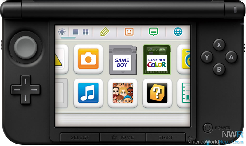
I wouldn't even mind if these options were only unlockable by spending Play Coins. Heck, I'd even pay real money to download an icon pack on the eShop if there were enough designs to choose from. Imagine storing all your Game Boy Virtual Console games behind an icon that looks like an old Game Boy cartridge! It's such a simple concept that I’ve whipped something together in PhotoShop. See how unique that looks? There's no way you'll be confused about what stuff you have stored under that icon!

Something like this would look so much nicer.
With Virtual Console running full steam ahead on Wii U's eShop service, Nintendo is going to have to implement a folder-like system for their home console in the near future as well. With a little creativity the visual possibilities are endless. Please, Nintendo, give us our graphics.
So what do you guys think? Are there any changes you'd like to see Nintendo make? We're all ears, and if we get any particularly interesting reader submissions we may even explore the idea in a future feature. Leave your comments in the Talkback thread below!