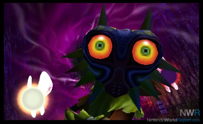
A few hours with Majora’s Mask 3D highlight what makes this remake so promising.
http://www.nintendoworldreport.com/hands-on-preview/39506/the-legend-of-zelda-majoras-mask-3d-preview
It seems like only yesterday that The Legend of Zelda: Majora’s Mask 3D was unveiled to the world. Fans have been clamoring for this remake for quite some time, and it came as a shock that we’d be getting this game in February, earlier than most people expected. With the final version of Majora’s Mask 3D in hand, I spent a lot of time with the Nintendo 64 classic over the past week.
Right off the bat, Majora’s Mask 3D looks absolutely gorgeous compared to the previous 3DS remake of Ocarina of Time. While Ocarina of Time 3D looked good, most of the textures and areas didn’t look that much better than the original Nintendo 64 release. Majora’s Mask, on the other hand, looks as if everything was made from the ground up, really showcasing what the 3DS is capable of. Any worry I had about the game’s darker art style not translating well to a portable experience quickly dissipated as soon as I started playing.
Quite a few elements of the game have been changed and streamlined as well. Like the Ocarina of Time remake, there’s a special stone located inside the Clock Tower where you meet the Happy Mask Salesman, which you can crawl into and get a vision of what you’re supposed to do next. This really helps when playing such a large game on a portable system, since it’s easy to lose track of what you were doing if you play this game on the go, and have to start and stop playing on a semi-frequent basis. It also helps that there are way more spots in the world to save your game, as compared to the original version, where you could only save at the Owl statues scattered across the game world.

So far, I’ve only really noticed one change to the game’s world, and that’s the location of the Bank Teller in Clock Town. He used to be located on the west side of town, but was moved right behind the Clock Tower, making it much easier to notice and find. The bank allowed you to deposit rupees, and retrieve them when you traveled back to the First Day, instead of losing them. The Bomber’s Notebook, as well as the hiding locations of the Bombers, have also changed. The notebook now gives players more detailed descriptions of locations and times of each of the game’s many sidequests and records, making the game not only feel more streamlined, but also easier to obtain every mask needed to unlock the final mask later in the game.
As far as the game feels, it’s essentially identical to the original release on N64, with a couple added benefits. The first one are the gyroscope controls that return from the 3DS remake of Ocarina of Time, allowing you to freely control your aiming by moving the system. This allows for more pinpoint accuracy with bubbles, arrows, and more. Thanks to the New 3DS XL, the face-tracking also allows me to not lose the 3D effect when moving the system around, so this feature has a big leg up over Ocarina of Time. Camera control can also be manipulated via the New 3DS’s C-Stick or the Circle Pad Pro, allowing you to rotate and scale the camera in various ways, similarly to how The Legend of Zelda: The Wind Waker’s camera operated.
As someone who absolutely adores Majora’s Mask, this 3DS remake has thoroughly impressed me so far, but I can’t say for sure how I truly feel about the game until I’ve fully completed it. We’ll have a full review up on February 4.