Post by: wandering on September 14, 2006, 10:44:21 AM
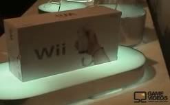
So sexy. Love the huge 'Wii' logo. I like the fact that packaging is so....confindent. It screams 'you know you want me' in the same way that Apple packaging does.
Also glad that they didn't put a picture of WiiSports on the cover. Though I'm a bit mixed about the heavy use of baby blue.
Now if we could only get some game boxart....
Post by: Ian Sane on September 14, 2006, 11:27:56 AM
Post by: Strell on September 14, 2006, 11:29:25 AM
It's white and elegant and sleek.
They'd have to chrome it up to make it look silly down the line.
Post by: Arbok on September 14, 2006, 11:31:31 AM
Post by: WalkingTheCow on September 14, 2006, 11:32:23 AM
Anyhow, nice looking box. I wonder if it's got a screenshot/game rollcall on the back.
Post by: jasonditz on September 14, 2006, 11:36:53 AM
Looks a lot like the box my Mac Mini came in.
Post by: Artimus on September 14, 2006, 11:40:28 AM
Post by: decoyman on September 14, 2006, 11:45:51 AM
Post by: wandering on September 14, 2006, 11:48:03 AM
Quote
I wonder if it's got a screenshot/game rollcall on the back.
I suspect we'll either get game shots or art. I wouldn't expect any loopy Miyamoto quotes this time around, though...
Post by: jasonditz on September 14, 2006, 11:49:34 AM
Quote
Originally posted by: Artimus
It won't look silly a few years from now. There are certain colours and designs that don't age poorly. Rich primary colours (red, royal blue, gold) never look bad. Minimalist design doesn't grow old. The designs that look poor are those that go with colours that fade in and out of favor (orange, brown) and designs with a lot of non-classic stuff happening (60s bubbles and circles, etc). Sleek doesn't grow old, though.
I'm still a big fan of faux wood panelling on game consoles.
Post by: Ian Sane on September 14, 2006, 11:56:43 AM
Then we can make bets over which of those games end up on a competing console or cancelled outright!
Post by: Hostile Creation on September 14, 2006, 12:08:32 PM
Unless they have something like that which we haven't seen yet.
Post by: King of Twitch on September 14, 2006, 12:11:01 PM
How about "Super Smash Brothers, both Zelda versions, and Metroid Prime 3 for launch!" in its place.
Post by: TrueNerd on September 14, 2006, 12:38:03 PM
Quote
Originally posted by: wandering
What WILL age are the shots of people using the wiimote and the stuff about how 'anyone can play'. Ever see an old ad for a computer? With the family, in 80's garb, smiling and gathered around the screen, as the ad explains how easy it is to use, and what you can use a computer for?Quote
I wonder if it's got a screenshot/game rollcall on the back.
I suspect we'll either get game shots or art. I wouldn't expect any loopy Miyamoto quotes this time around, though...
Oh man, that quote alone (and maybe Metroid Prime and Wind Waker) sold me on the GameCube. It was like, YES. I want to open every door in the world.
Post by: IceCold on September 14, 2006, 03:12:10 PM
Post by: Athrun Zala on September 14, 2006, 07:17:11 PM
Post by: Caliban on September 14, 2006, 09:32:46 PM
Post by: wandering on September 14, 2006, 10:43:26 PM

edit: whoops, that's the wiimote.
Post by: GoldenPhoenix on September 14, 2006, 11:24:44 PM
Post by: Shorty McNostril on September 15, 2006, 02:24:57 AM
Boxart
Apparently this is what we will be stacking in our dvd towers. I have no complaints. I just assume that the monkeyball one isnt finished because i dont see any nintendo logo on it anywhere.
Post by: wandering on September 15, 2006, 02:42:53 AM
I like it. Differentiates itself nicely from the competition. I kind of figured either every game would say 'only for', or none of them would. Kind of glad they went the latter route, makes it that much cleaner.
Post by: jasonditz on September 15, 2006, 06:05:53 AM
Post by: Artimus on September 15, 2006, 06:29:07 AM
Post by: Hocotate on September 15, 2006, 06:48:38 AM