Post by: vudu on November 16, 2006, 10:27:34 AM
I like it though; very clean looking. The main page really isn't that different that the PGC main page; it just has a fresh coat of paint.
Post by: KnowsNothing on November 16, 2006, 10:39:09 AM
But whatever, looks good
Post by: Shift Key on November 16, 2006, 10:40:59 AM
Post by: KnowsNothing on November 16, 2006, 10:43:00 AM
Post by: Robageejammin on November 16, 2006, 10:47:23 AM
Really though, awesome job guys. It'll be the first site I visit this Sunday
Post by: Shift Key on November 16, 2006, 10:52:48 AM
Quote
Originally posted by: KnowsNothing
adblockah
Oh yeah, mine is working as normal too. I just saw the "Advertisement" warning there.
Post by: Kairon on November 16, 2006, 11:08:58 AM
[kneejerk reaction]
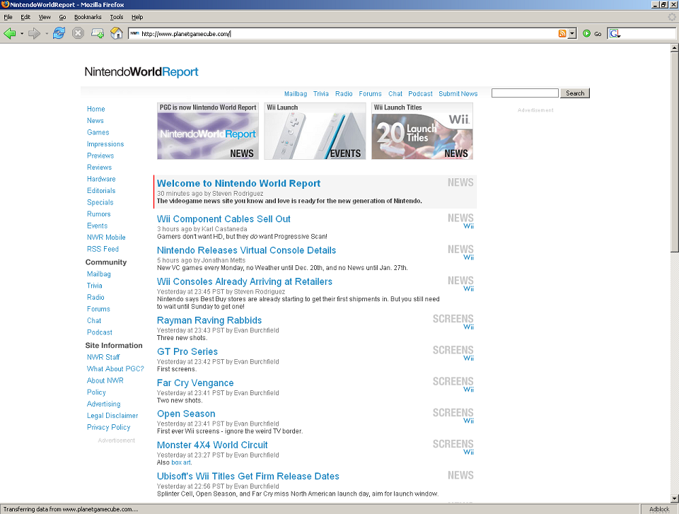
The idea of white is supposed to make things look clean and contemporary, but instead you guys clutter everything up excessively with text and ads, killing the effect and turning a post-modern sensibility into a lazy-esque white background for big groups of text?
Now it...just looks like a cheap blog?
[/kneejerk reaction]
/cries
I feel so weird and disappointed and confused!
~Carmine M. Red
Kairon@aol.com
Post by: BigJim on November 16, 2006, 11:11:18 AM
Post by: Kairon on November 16, 2006, 11:13:02 AM
~Carmine M. Red
Kairon@aol.com
Post by: thepoga on November 16, 2006, 11:22:51 AM
Post by: The Traveller on November 16, 2006, 11:25:41 AM
Post by: nitsu niflheim on November 16, 2006, 11:26:15 AM
Post by: Sir_Stabbalot on November 16, 2006, 11:34:13 AM
Post by: Smoke39 on November 16, 2006, 12:00:57 PM
Also, the sidebar appears to be a bit missplaced in Mozilla? :b pic
Post by: Jonnyboy117 on November 16, 2006, 12:44:44 PM
Quote
Originally posted by: Smoke39
I agree with nitsu. Some more separation would be nice.
Also, the sidebar appears to be a bit missplaced in Mozilla? :b pic
It's definitely not supposed to look like that. I've notified TYP and I'm sure he'll check it out ASAP.
Post by: j_moose on November 16, 2006, 02:00:05 PM
Post by: decoyman on November 16, 2006, 02:09:38 PM
1. For such a typographic, text-centric site as NWR, your textual hierarchy isn't nearly strong enough. Your text fields bleed into one another, and I'm left asking, What am I supposed to read first? Next? Last? Not at all? There's no dominant design element, making the other elements feel "squishy" in their placements, as if they could float around without ever clicking into place somewhere). Now, your advertisers are probably happy that their ads are in contrast so bold, but... come on, give the visuals of your site some graphical weapons to fight back against them!
2. The site "logo" hasn't been pushed enough yet – where's the polish and detail? It says "Round 1" to me. What does the 5th round look like? The 10th? Now, I don't mean that the base design has to change – just that, if you keep refining it, how does it evolve? That may very well be the dominant element you're missing right now that makes my eye float around without ever settling on something. A logo, before anything, must be flexible. Does it have a vertical or stacked orientation (because honestly, a stacked version would fit in the corner much better in the current design)? How does it translate when it's very small and very large? The browser-line graphic demonstrates that it doesn't translate into small sizes well. And when large, as I mentioned before, I'd want more attention to detail and/or evidence that someone painstakingly crafted every little serif (ok, there aren't any serifs, but you know what I mean
3. It's too plain. It doesn't come off as minimalistic, but rather unfinished and, almost oxymoronically, cluttered. A few masterfully-placed strokes/rules could make all the difference, but it's hard to tell without seeing how the design reacts. If we take a look at the Wii console – and it's clear the design draws heavy inspiration from Nintendo's newest arrival – it's not just a seemless slab of white resin – there are seams, feet, a disc slot, vents, a stand, etc. Given the amount of info you need to fit onto the front page as a news source, it needs a better "tray" to deliver it all.
Ok, a critique is comprised of pointing out what needs work and what's already working, so keep your head up! There ARE things which are working really well. Maybe these could serve as guideposts for bringing the rest of your elements up to the same level.
1. The "Lead Post" designation, with the vertical red rule. Dig it. I'm supposed to read this first. It beckons to me with hungry eyes.
2. Image Viewer is pretty slick. It's flashy and effective. On my machine, it's a little slower than just loading up a new HTML page, but I'd say it's worth the trade off.
3. Name. It transcends fansite-dom, which is fitting since this is the most professional independent Nintendo news site around. I also like the acronym. NWR. It doesn't quite roll off the tongue as well as PGC, but it'll become more and more second nature the longer it's around.
There's good groundwork laid here, guys. To me, though, this is only the beginning. A few revisions could improve it vastly. I just hope some of my comments can help it reach its full potential.
Post by: KnowsNothing on November 16, 2006, 02:20:01 PM

That logo is more dynamic, it can be used for a lot more than the full version. Still though, it's nowhere near as awesome as the PGC logo. But then again, compared to the genius GC and N64 logos, the Wii logo sucks too =p
Post by: vudu on November 16, 2006, 02:28:02 PM

Post by: vudu on November 16, 2006, 02:38:49 PM
Post by: vudu on November 16, 2006, 02:47:34 PM
First, you did a pretty good job eradicating PGC from the forums but it still says "Please Read the Planet GameCube Forum Rules. Your use of the Planet GameCube Forums is contingent upon your agreeing to abide by the rules" on the top of the main forum page.
More importantly, have you guys considered adding a forum for VC games? I know it kind of fits in with Wii, but not really because they're games for NES, Genesis, etc. It doesn't really belong in the other systems thread either. And if we put talk for the VC in either of those threads things are going to get pretty lost once we get a lot of VC games.
Post by: Artimus on November 16, 2006, 02:58:19 PM
I like the name, but this new design doesn't work. The meat of it works (image viewer, for example, is superb) but the skin doesn't. I agree with everything said here. It feels like a bad mix of a blog and a Google News search. The logo does nothing, and says nothing. I'm all for simpler text logos, but there's a point when your logo isn't a logo but just text. Look at something like the engadget logo, which is very similar but the little wireless broadcast waves give it a ton of personality. Maybe make the "t" in Report a Wii d-pad? I know the actual Wii logo is extremely simple, but it has the added advantage of the bow animation.
I also definitely second the notion of bars or something separating things. The left hand column feels particularly odd, something about the font and the spacing and the lack of any vertical separation just looks weird. Everytime I look I just think it's not an actual webpage. It's so sparse.
I don't want to be harsh, because the new content and things are great, as is the name. But I'm afraid the new design just doesn't work at all. The idea behind it is solid, but this design does not work. I know it'll develop overtime, but hopefully it'll be improved sooner rather than later. The thing is that if I was new to the site and had just stumbled on it looking for a Nintendo news site I woudn't stay longer than 30 seconds. Something about it just screams bad attempt at minimalism and the white with no focal point hurts the eyes. It just doesn't feel professional to me at all, but like a teenager's attempt at being professional. The old PGC site was a little homely, but it at least felt like it had content.
I think what I mean to say is that it feels like it was generated from a WordPress template or something.
Post by: KnowsNothing on November 16, 2006, 03:05:15 PM
Quote
Copyright 2003 Planet GameCube. All your post are belong to us.
Please Read the Planet GameCube Forum Rules. Your use of the Planet GameCube Forums is contingent upon your agreeing to abide by the rules.
FuseTalk 4.0 - Copyright © 1999-2002 FuseTalk Inc. All rights reserved.
Post by: Grant10k on November 16, 2006, 03:10:07 PM
The name is one of those that you sorta forget after about a second or two.
Post by: Shecky on November 16, 2006, 04:20:53 PM
I like the logo, I like the simplicity
In short.
I like it!
Post by: Ceric on November 16, 2006, 04:40:16 PM
I do have to say the new Screens view is nice though I wish there was a way to just press a button and go to the next one.
Post by: couchmonkey on November 16, 2006, 05:17:34 PM
- I find the menu bar kind of melts into all the other text on the page.
- The watermark on images seems bigger than ever - an unfortunate trend across all media these days.
- Feels very empty. The excitement I used to feel when I opened the site is gone, to be honest. (this is my smallest complaint, though)
Kudos (argh so cute):
- The new image viewer is nifty
- the main headlines are nicely split up
Post by: Nephilim on November 16, 2006, 05:21:42 PM
works fine in opera 9.10 beta
Post by: Tansunn on November 16, 2006, 07:15:30 PM
My only other criticism is the lack of visual separation between elements. The sidebar, the header, individual updates, they're all visually the same. There's nothing distinguishing between them. Even something as simple as a horizontal rule between updates, or like these forums, a different shaded background from one to the next. The design is nice and clean, but perhaps it's TOO clean.
EDIT: My laptop screen has a noticeable decrease in contract when viewed head-on. I viewed it at an angle and realized there's a bit more visual separation on individual game pages, it's just too subtle to see unless viewing my screen at an angle. It still feels a bit lacking to me on the main page, though.
Also, the image viewer doesn't work if the thumbnails are still loading. It'll just link directly to that image instead of loading it within the same page. Might want to find a way to code it to load the image viewer before the thumbnail images.
Post by: Artimus on November 17, 2006, 12:22:22 AM
Post by: Ceric on November 17, 2006, 12:43:56 AM
Also I casting my lot with having a next button on the Picture Viewer.
Post by: vudu on November 17, 2006, 04:16:28 AM
Post by: vudu on November 17, 2006, 06:38:51 AM
Post by: UltimatePartyBear on November 17, 2006, 07:09:57 AM
Quote
We have been also been featured in major publications....
Also, I just noticed that the Talkback link on the Elite Beat Agents review didn't show up until after I posted a comment in that thread.
Post by: Donutt007 on November 17, 2006, 07:54:10 AM
I like the right side of the main page where it says what department it's for i.e. ds, Wii, GBA, etc.
I also like the "x hour(s) ago", nice touch.
Yes the White is nice, but it does kinda make it look like a bogus site, maybe add a touch of color
Post by: NinGurl69 *huggles on November 17, 2006, 07:55:21 AM
I'm also disappointed you had to use Nintendo's name in the site name. It does make the site sound self-explanatory, but in principle, it's not yours. Ran out of clever "N" abbreviations?
I still suggest "UR-N-World". It's not too late to change.
THANKS FOR THE DISASTER
I'm done.
Post by: Smoke39 on November 17, 2006, 02:38:59 PM
Quote
Originally posted by: Professional 666
"EN DOUBLE YOU ARR" is jarring to say and read.
Nwer. It's pronounced "nwer."
Post by: tahnok100 on November 17, 2006, 08:06:51 PM
Definitely has potential. Definitely needs work.
Post by: Arbok on November 18, 2006, 03:22:09 AM
However, I would also like to state that I know hearing critiscm about this stuff is pretty hard; I recently redesigned the front of my own site, which recieved a lot of similar criticism from my viewers, and it was hard to hear due to the work I put into its look, but I did get some good feedback about what might be improved on.
Post by: Athrun Zala on November 18, 2006, 09:19:24 AM
and add me to the "Prev/Next Button" list ^^
Post by: matt oz on November 19, 2006, 05:09:17 PM
Post by: Kairon on November 19, 2006, 06:17:52 PM
~Carmine M. Red
Kairon@aol.com
Post by: Dirk Temporo on November 22, 2006, 03:33:57 PM
Post by: TheYoungerPlumber on November 26, 2006, 08:25:46 PM
Post by: Tansunn on November 26, 2006, 10:17:46 PM
Post by: Athrun Zala on November 27, 2006, 03:29:07 AM
Quoteyep, updated to FF2 and the problem is gone
Originally posted by: TheYoungerPlumber
Please try updating FireFox. I know the site has problems with older FireFox browsers (1.0.*), but if you're using that it's time for an update. Try upgrading to 1.5.* or 2.
Post by: Smoke39 on November 27, 2006, 05:21:47 AM
Post by: UltimatePartyBear on November 27, 2006, 06:30:11 AM
To whoever is responsible for such things: Thank you for the previous and next buttons on the image viewer.
Post by: Smoke39 on November 27, 2006, 02:55:55 PM
Post by: vudu on November 28, 2006, 06:01:58 AM
One of my casual gamer friends asked me about the problem he's heard about with people's wrist straps breaking. He wasn't sure exactly how the strap worked so I wanted to link him to a picture of one. Instead, I had to link him here and tell him to click on the picture on the far left, fourth from the top.
You could consider it a minor inconvenience, but it seems like a big oversight.
Post by: UltimatePartyBear on November 28, 2006, 07:19:13 AM
Post by: Ceric on November 30, 2006, 05:27:08 AM